Tuesday, April 15, 2014

Wax on, Wax off

I am not a competitive person. I am quite pleased to waddle through life, doing my own thing, oblivious to any ladders that require climbing or plateaus that need reaching. My odd bird feathers are not easily ruffled.

But given a challenge or dare... well, my mind is set alight and determination sets in. Over and over thoughts will tumble in my brain until, at last, a solution finds a way out. Whether or not the challenger ever sees the results is irrelevant. All is well with the world so long as I know the riddle was solved.


And so begins the tale of these cards. When my son’s sensei mentioned creating a karate themed craft, my mind raced.


Using the beautiful papers of Bird Song I’ve created a series of cards inspired by the belt colours yellow, orange, blue, green, brown and black.


The cards are simple and restrained, reflecting some of the principles of martial arts: to be humble, outwardly gentle, and display courtesy. An ideal way to commemorate the important milestones of belt achievement.


More pics (and other great projects!) on the Graphic 45 blog.

Supply List:

Friday, April 11, 2014

Helloooo spring!

What? What's that I see? Could it be? Is it? GREEN!


It might not be lush green, and a tad brownish, but it's not a landscape of white and that's what matters.


There are signs of springs arrival everywhere!


Sure there's a little snow lingering...


... but there are brights sprouts pushing through the earth too!


I am not the only one pleased that spring has finally arrived.

Tuesday, April 08, 2014

Petaloo excitement!

I am beyond excited to announce that Petaloo has kindly invited me to join their design team!

I really am completely thrilled about the position because I truly, deeply, madly LOVE their products. Just take a gander at these beauties!


Their Botanica collection is to die for. Absolutely stunning.

Can not wait to regularly share some projects inspired by their products! Until then, hop over to the Petaloo blog and check out the gorgeous creations made by the rest of the Petaloo gang :)

Thursday, April 03, 2014

Punch and Judy 'By the Sea' Theatre

I realize it's been quiet around these parts over the past week or so BUT I have a really good excuse: I made the top 30 for the Graphic 45 design team and I've been working on my super special project for round 2!

Are you ready?

Here's my Punch and Judy "By the Sea" Theatre...

If you aren't familiar with Punch and Judy they play a big role in the culture of the British sea side. It's a sort of violent puppet show which can be dated back to just before the 1700's, reaching a height of popularity during the Victorian era.


Now, see that little knob?


Turn it and Punch and Judy whack one another! You just can't argue with a 100's year old tradition.


 AND if you want to make your own there's a tutorial!


... and here is the accompanying print out (click for full size)

... and finally, here is the complete supply list


Corrugated cardboard
Thin wood doweling
Coffee stir sticks
Drinking straw
Jute twine
Hot glue & adhesives

Tuesday, April 01, 2014

An altered bit-o-wood

HAPPY APRIL FOOLS! I think spring may have actually arrived. It has been a long cold winter and I for one am glad to see small patches of grass through the snow... even if they are brown ;) 

This is one of the pieces that I've been sitting on patiently (ok, maybe a little excitedly) waiting to show you.

The base is a Walnut Hollow Innkeeper Signboard to which chipboard gears, Typography, and a slew of bits and bobs have been applied.


The little burnt out lightbulbs were found at the bottom of a box of junk we bought at auction last year. SEE there is a reason to keep absolutely everything!


Those wonderful gears are from Gina's Designs which have been painted witch copper paint and then distressed. The sentiment "Let me think" is from a vintage kids book that I regularly, gleefully, tear into.


There's a few more pics over on the Graphic 45 blog today, along with a beautiful project by the ever amazing Rhea Freitag. Definitely worth a hop over :)

SUPPLY LIST
Typography  > 
JourneyTypography  > 
Create
Graphic 45 Staples

Antique Metal Door Pull>  
Ornate Metal Keys>
 Ornate Metal Key Holes>
 Ornate Metal Label Holder>  
Washi Tape Set
Metal Tag

Walnut Hollow Innkeeper Signboard 14”
Petaloo Colour Me Crazy Chipboard Gears 

Gina’s Designs Cardstock Doily Set Steampunk
Gina’s Designs Steampunk Shape Set
  Fairy Vials  
Metallic Mini Brads 
Metal Hands 
Vintage cabinet card image
Tiny watch parts
Vintage watch spring
Burnt out mini lamp bulbs
Buttons

Friday, March 28, 2014

Fancy schmancy picture taking

I need a new camera. Mine is slowly deteriorating and there's now a lovely blotch of something on the lens. It's not terribly noticeable... but I know it's there. Although it's time to move on, I'm reluctant because I love my camera. It's a just a little compact Sony BUT it gets the job done and I'm not terrified of dropping it.

Before this bad boy goes into semi-retirement, I thought I'd talk a bit about photography. I get a number of questions about shooting and to be absolutely honest this is set up for 99% of the things I shoot...


 ... a dinged up camera, a window, and a thick piece of white cardboard. That's it. I do have a lightbox but I only use it in emergencies or when I'm shooting glass objects and dealing with reflections (I'm just too damned lazy to iron the backdrop).

Before I go any further I should note here that I am NOT a photographer so the 'tips' I'm about to share will make anyone with any sort of knowledge shudder. Take everything I'm about to tell you with a grain of salt. I'm just trying to pass along a few pointers that work for me when shooting my work for the web.

So, my 'product' shots are almost always set up something like this:


I simply place my item on a large opaque white piece of cardstock. If I can not shoot outside, I find the brightest source of NATURAL light in the house, preferably with the light hitting the front of the item. I shoot on "Auto" mode, with my macro setting turned on (because I often shoot close-ups of detail), flash turned off. I also shoot larger than I need to just in case. You can always shrink your images, but you can never make them larger.

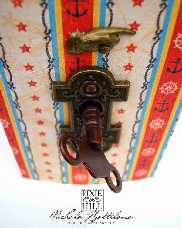
So, this is the untouched shot from the above set up.


You can see there's a bit of a funky shadow happening on the lower right of the photo. Look out for details like this  when setting up. Fiddle around and adjust until there's nothing terribly ugly going on. Bright but slightly overcast weather is great, it reduces harsh shadows. Now take LOADS of photos! It only takes a few minutes to shoot a dozen extra shots and it's absolutely worth having those extras to choose from.

I don't mind that the photo is a little grey because I adjust all of my photos before publishing them. I use Photoshop. The two adjustments I almost always make are to the 'Levels' (to brighten and add depth) and 'Selective Colour' (to remove excess colour from my whites). Here's my pic after being jumbled around in Photoshop and slapped with a watermark. There's still some cyan in the white but you get the idea...


But not everyone has Photoshop! Luckily there's a number of free online photo editors. Below I'm using pixlr.com to fiddle with this image. Now, sometimes just selecting "Auto Levels" will be enough to improve a photo... but this can also have strange results at times. Don't be afraid of playing around to see what all of the different 'adjustments' do. That's exactly how I learned. Here I am fiddling with the 'Levels'...


See that box with the graph looking thing? It's really not that scary or complicated. Let's take a better look at that box...


Those little house looking things slide from side to side. The black box on the left represents black/dark colours, moving it to the right makes them darker. The middle box represents midtones/neutral areas and moving it left will brighten your midtones, to the right and they will darken. The box on the right adjusts the lightest areas, sliding it to the left will lighten the lightest areas of your picture.

I was taught that you should adjust using "Curves" not "Levels" ... but I've never seen eye to eye with that method and this works just fine for me. I suggest you do the same, experiment that is, and do what works for you... even if that means ignoring everything I've just said. Whatever gets the job done is the right and proper way to do things.

Anyway, the point of this whole blabby post is just to say that you don't need loads of fancy equipment to take fair shots of your work. Natural light, loads of pictures, a little practice and experimentation editing can help you tremendously without investing in loads of fancy equipment.

All that said, I would not sneeze at a nice fancy camera that had loads of bells and whistles to fiddle and have fun with :) My birthday does end in a "0" this year so that means an extra nice prezzie right?

Wednesday, March 26, 2014

Petaloo redo with Marion Smith

A while ago... a long while... my friend gifted me this sweet little house to play with...


It has sat quietly for a very long time, waiting patiently for attention.

Not quite so long ago Petaloo asked if might like to be a guest designer during their Marion Smith blog hop. I love Petaloo's products so I jumped at the chance! As soon as I saw the Marion Smith papers I knew they were destined to transform this cutie into a shabby chic abode.

So with a bit of love, products and a bucket of glue, here's the after:


You can see more pics over on the Petaloo blog but here are a couple of my favourite details:


The copper drain pipe. It's simply a bendy drinking straw painted with copper enamel paint but I sort of love it. I'm also pretty proud of that roof tpp! I made a slew of those tiles and still ran out halfway through and had to make a second batch. The effect was totally worth the effort.
And finally a peek at the interior which is very fancy indeed with loads of beautiful floral products from Petaloo and a very important tea box hedgehog :)


It was an absolute pleasure to design for Petaloo during the Marion Smith blog hop. And, just in case something strikes your fancy, here's a list of the products I used...


Petaloo
Botanica Blooms Pink & Teal
Botanica Mini's Pink  & Teal
Botanica Chantilly Mixed Blooms Cream

Spring Berry Clusters Pink
Flora Doodles Velvet Hydrangeas Cream & Pink
Marion Smith MOTLEY
Off the Wall
Not too Shabby
Collage
• Darling
Archive
Marion Smith NEVER GROW UP
• In the Garden
• Treasure Map
• Never Never
Other Products
Flower and Leaves Dresden Borders
Chipboard Window Frames
Bendy Straws
Wooden Stir Sticks
Miscellaneous buttons and other vintage 'junk'
Glue
Acrylic Paint